ABOUT ME. Hello. As a designer, I shape information architectures, design systems, and UX research – from first hypothesis to validated interface, with a clear compass for digital excellence that delivers measurable results.
WORK. Deep understanding & comprehensive experience in Brand & visual Identity, UX/UI Design, Web Design, Print & Editorial Design, Corporate Design, Agentic Prototyping.
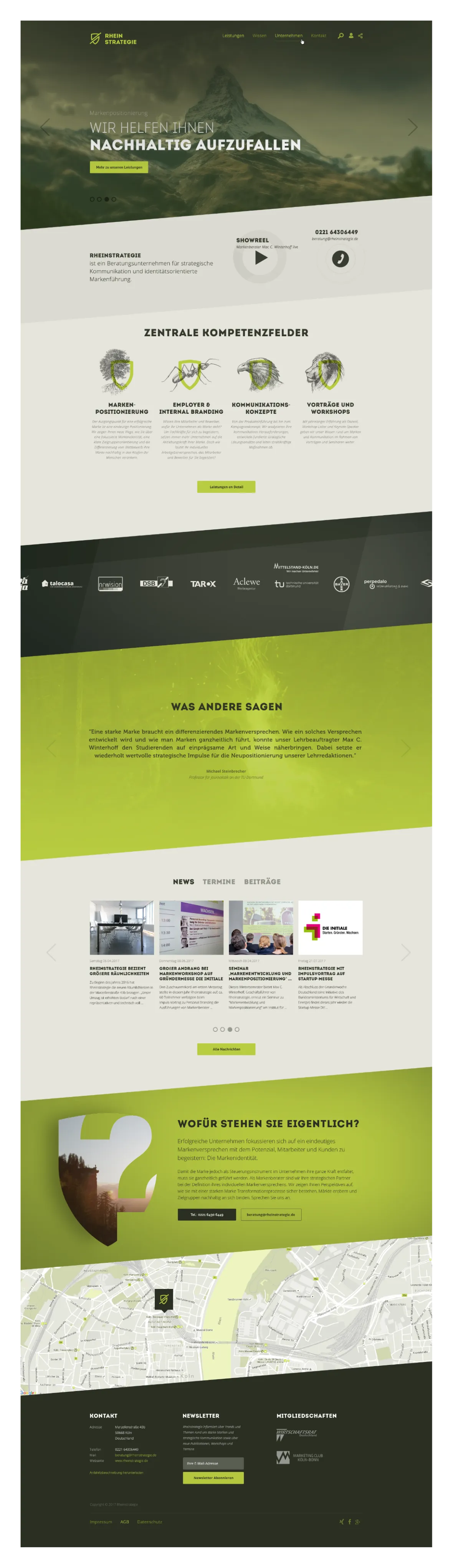
Rheinstrategie
A consultancy brand that shows up online with the same independence it advises on offline.
Complete website relaunch for Rheinstrategie, a consultancy for strategic communication and brand management. Before the relaunch, the consultancy lacked a digital presence that carried its strategic self-image – stock photography and standard templates left it indistinguishable from the anonymous agency field. The new visual identity turns the agency itself into a case study for differentiating brand work: image concept, a bespoke icon system and the responsive WordPress implementation interlock so every touchpoint carries the same posture – monumental nature motifs next to line-precise pictograms, content next to gesture. I owned the entire build from the first moodboard to the deployed WordPress instance.
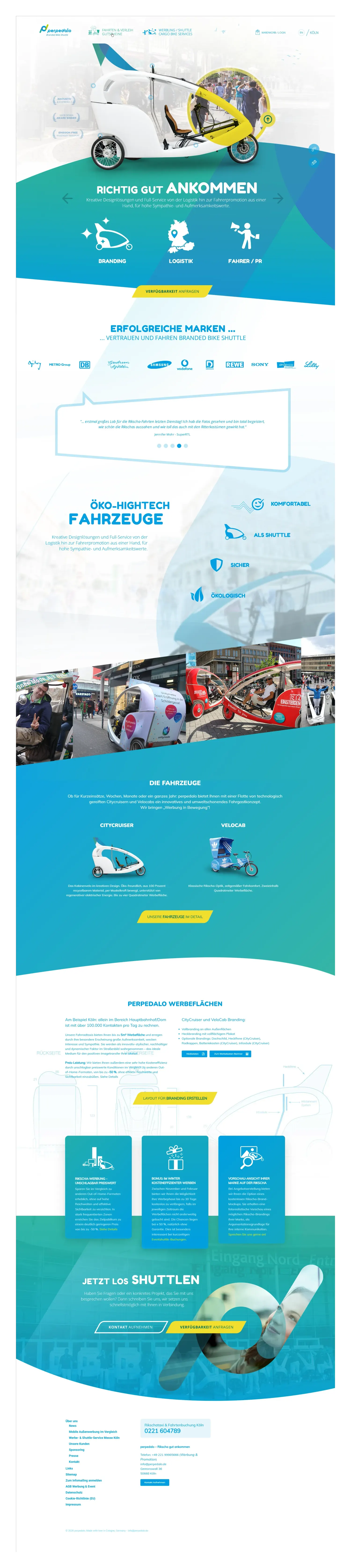
perpedalo – Rikscha gut ankommen
A mobility brand whose logo gesture carries motion – without resorting to a single arrow cliché.
For perpedalo – Branded Bike Shuttle, the entire brand identity was developed and refined over an extended period: from a fundamental logo redesign and corporate design through to a full web presence with dedicated landing pages for the Shuttle, Logistics and Branding business units. An annually updated, interactive B2B media-data brochure was added on top, translating a complex service and pricing portfolio into a visually accessible sales document with download templates and technical specs. All graphics, cut-outs, infographics and print files were produced in-house – from concept to production-ready artwork.
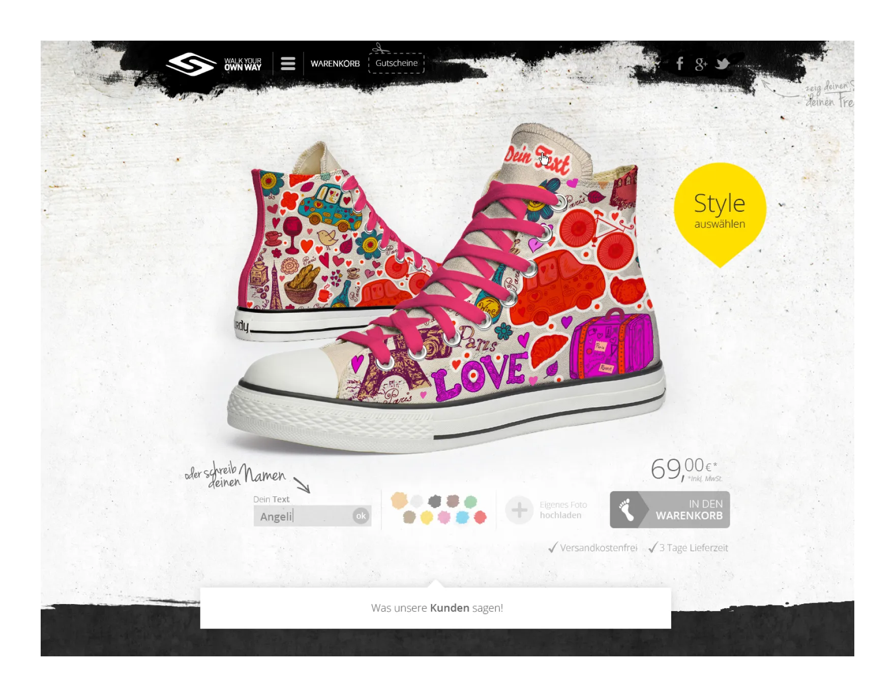
Scurdy – Shoe Configurator
A configurator that stages the sneaker as a tactile object – not as a 3D demo.
For the Cologne-based startup Scurdy, the complete interface design of an online configurator for personalised sneakers was created. Users could shape sole, upper and accent areas in their own colour combinations, add their own text and have personal photos printed onto the material – a mass-customisation approach that set the brand apart from interchangeable streetwear ranges. The design concept covered the product page, checkout flow and landing page. A product video was additionally conceived and produced, making the configurator’s mechanics visually tangible – the central communication asset both for the target audience and for investors in the startup’s early growth phase.
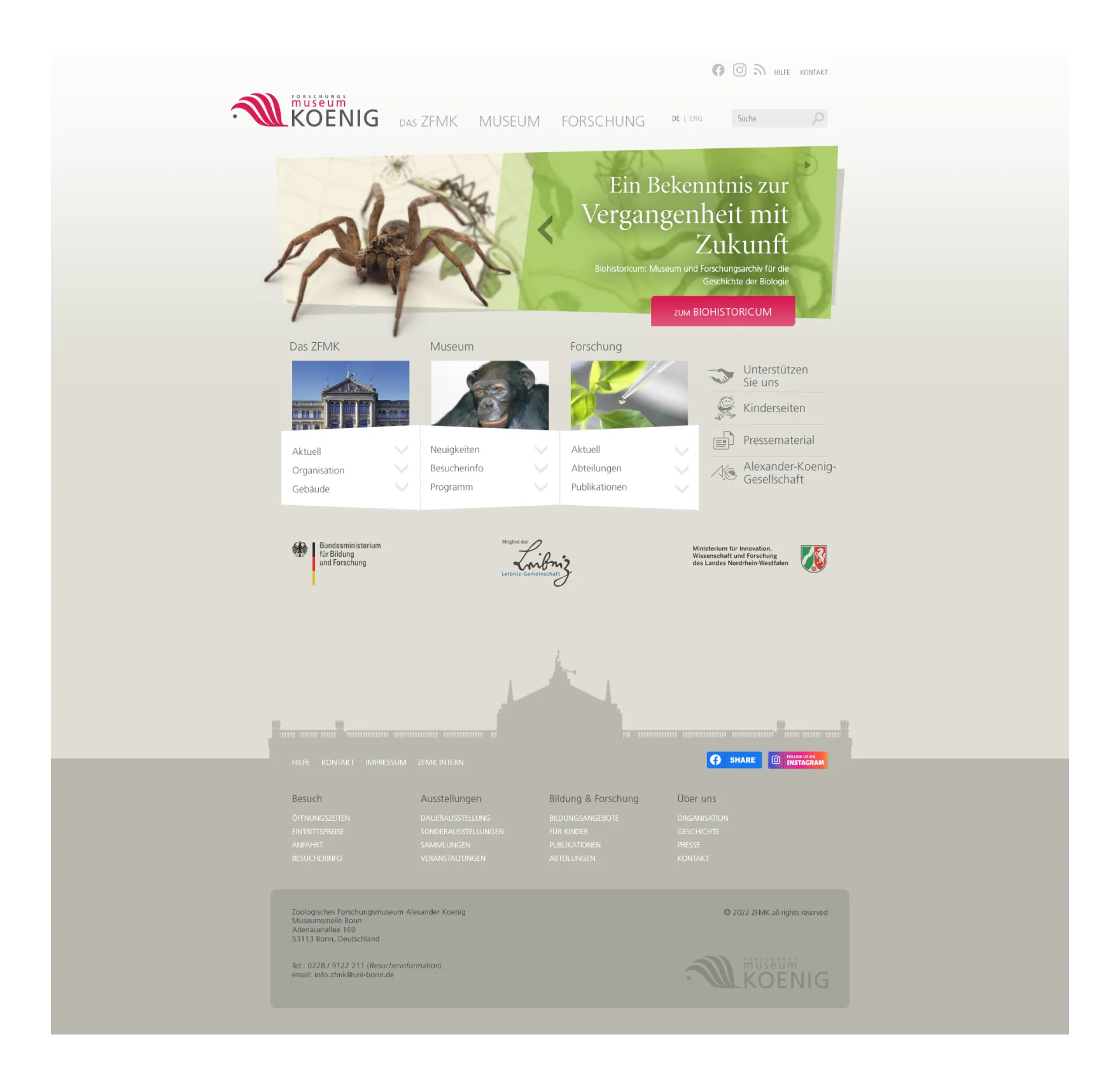
Museum Koenig
A museum platform that serves five audiences at once without selling out to any.
Screen design for the Zoological Research Museum Alexander Koenig in Bonn, developed on behalf of the agency Data in Transit. Based on a data-driven audit of the existing site structure and usage statistics, a new information architecture was developed serving five heterogeneous audiences – from museum visitors and children to scientists and political decision-makers – via a consolidated three-pillar navigation. The screen design translated the strategic requirements of the base concept into an image-heavy, link-oriented interface with a teaser system, hub pages and responsive page types. The mascot ‘Hippoline’ was developed as part of the same project, visually detaching the children’s area from the scientific gravity of the main site.
F27 B2B Credit Calculator
A banking tool that works inside the sales conversation – instead of interrupting it.
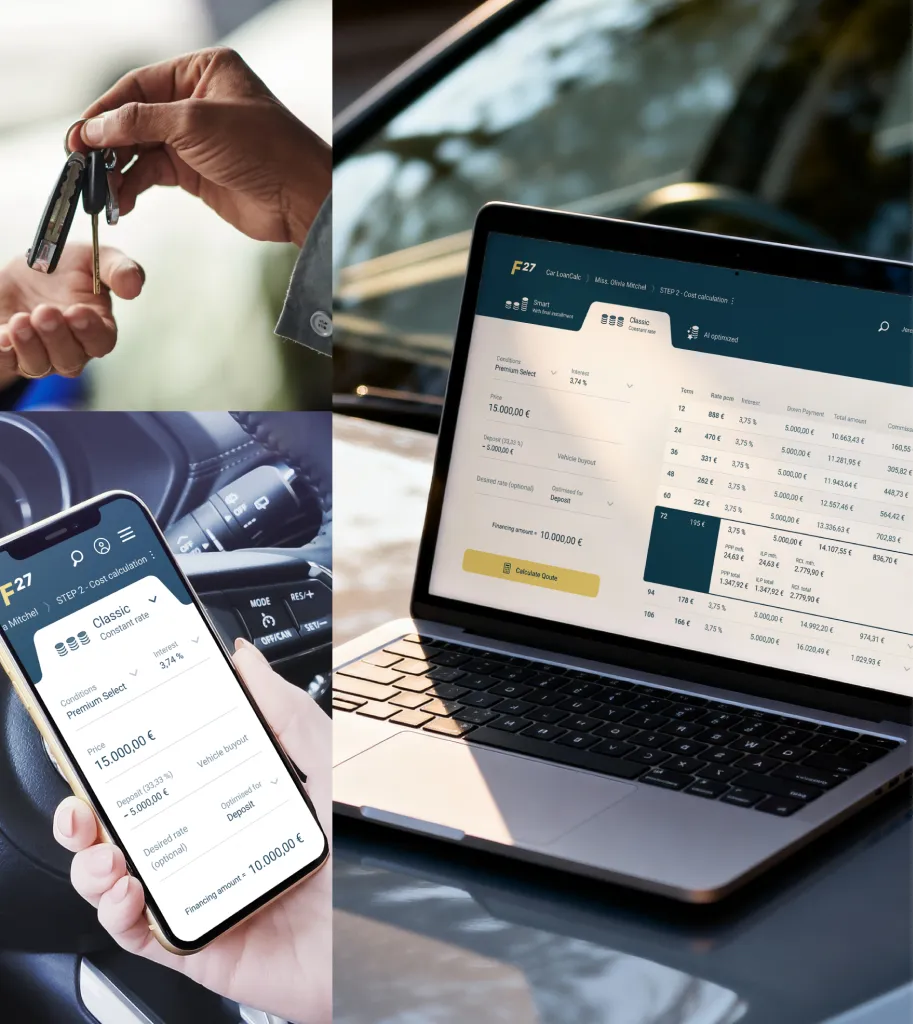
Complete relaunch of the B2B2C credit platform F27 for the eponymous bank (F27 – Car Credit) – a point-of-sale solution that enables car dealers to generate credit offers for their end customers directly during the sales conversation and receive credit approval within minutes. The project encompassed a discovery phase with stakeholder interviews, a new information architecture, end-to-end user flows, a design system and the entire interface built on top of it. Independently, I developed a comprehensive persona study as a strategic foundation: five data-based car-dealer personas grounded in the Sinus-Milieus model, derived from guided interviews, synthesised via affinity mapping and validated with stakeholders. Delivered as digital and printed setcards, they are now a fixed component of product development – actively used by product owners and management. Today, I extend this kind of B2B interface and design-system work through AI-assisted prototyping and agentic coding – from rapid flow and component variants through to production-oriented implementation and documentation.
Quintus Design System
A design system that thinks in layers – each with exactly one job.
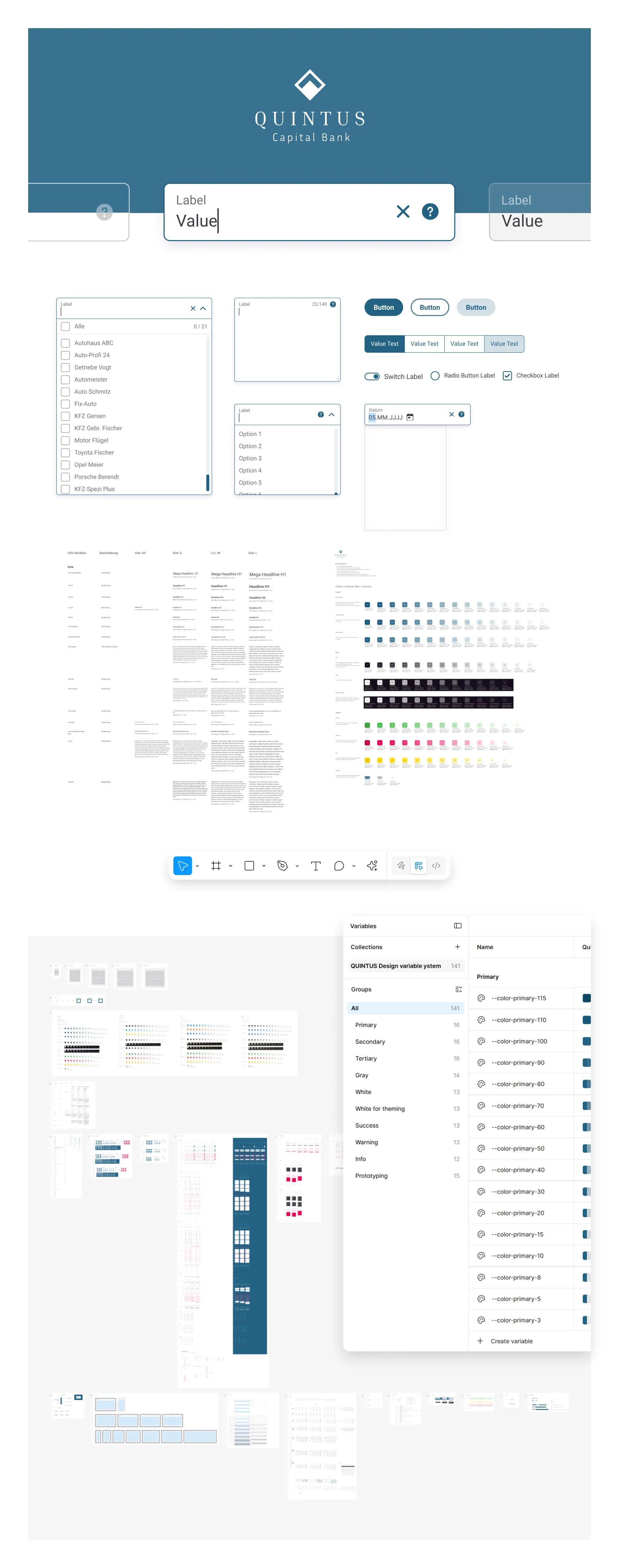
Development of a scalable, token-based design system for six product lines (B2B/B2C) at Quintus Capital Bank – multi-brand-capable, WCAG 2.2 AA compliant, documented in both Figma and Storybook. The architecture distinguishes three token layers: primary tokens as numerical tonal scales, semantic tokens above them (success, warning, theming), and finally component tokens. From Figma design variables, tokens are pushed via a pipeline to GitLab and are thereby directly available inside the front-end teams’ dev structures. Storybook serves as interactive component documentation and shared language between design and engineering – every new component appears there live before it is rolled out into a product line. Today, I extend this kind of design-system work through AI-assisted prototyping and agentic coding – from token and component logic to variant exploration, production-oriented documentation and implementation.
M1 - B2C Credit Calculator
A credit application journey that puts the smartphone centre stage – not in the breakdown lane.
Concept and design of a mobile-first credit application journey for the bank M1 – Mobility First Finance. The B2C platform guides end customers in Germany from the rate calculator through the credit-bureau check to video-ident or PostIdent verification – consistently anchored on the smartphone as the primary reference point. An initial Design Sprint validated the conversion-critical flows; the resulting hypotheses moved through wireframes, clickable prototypes and usability sessions before entering the design system. As lead product designer, I owned the transition into the continuous optimisation phase – A/B tests, heatmaps and funnel analyses iteratively condensed the interface and reduced friction at every individual step of the journey. The platform was designed as white-label-capable from the outset and rolled out to nine distribution partners across automotive retail and online marketplaces – dedicated colour palette, typography and tone of voice per partner on an identical technical base and identical UX logic. Today, I extend this type of conversion and interface work through AI-assisted prototyping and agentic coding – from rapid variants for calculators, forms and mobile flows through to production-oriented implementation and documentation.
Vermessungsbüro Hülsmann
A surveying practice whose digital presence takes its hands-on tradition seriously, rather than disguising it.
For Vermessungsbüro Hülsmann in Detmold, the existing web presence was redesigned both visually and structurally. The redesign sharpens the positioning as a modern, trustworthy engineering practice and makes a complex range of services equally accessible to property developers, private individuals and specialist audiences. Restructuring the services into the categories Road, Property and Building creates clear entry points and reduces cognitive load – visitors find what they need within seconds, rather than wading through bureaucratic prose. In the same pass, the wordmark–pictorial mark received a subtle refinement: alignment and proportions corrected without altering the established core appearance.
Bayer Gast
Six grown sub-brands under one roof – harmonised without disappearing into the template.
Corporate design refresh for Bayer Gastronomie as part of an endorsement strategy. Six sub-brands grown over years were visually harmonised without flattening their individual personalities. The umbrella positioning ‘Welcome to Diversity’ was sharpened and a consistent brand experience built across all locations – at deliberately low reflagging cost and without a hard break from the workforce’s established brand perception. The result was a fully documented system: alongside the corporate design manual, an employee handbook, application templates and training materials were created, enabling the internal marketing team to maintain the identity after handover without external agency support.
NRWision – TV-Lernsender
A media library that lets its content shine – instead of outshining it with interface poetry.
Complete screen design for the citizen media platform NRWision – the educational TV broadcaster for North Rhine-Westphalia. Based on a brand identity previously developed by Rheinstrategie, seven responsive page types were created (homepage, media library, detail page, programme preview, search, category and topic hub) along with a full player skin for Video.js with an end-card concept for audio and video content. The result was a production-ready design system including light and dark mode and a factsheet that documented colour values, typography, grid and component logic in full for handover to the TYPO3 development team – the back-end team could ship the implementation without further design consultation.
Kurt – Institut für Journalismus
Four newsrooms, one voice – carried by a diagonal at −38°.
Development of a cross-media umbrella brand for the teaching newsrooms of the Institute for Journalism at TU Dortmund – from strategic brand modelling through three distinct logo designs to a complete corporate design manual. The brand KURT unites the previously separate editorial departments of TV, radio, print and online under one identity-forming presence with the core promise ‘Just like you’. In collaboration with the brand consultancy Rheinstrategie, I owned the design pillar of the project: logo system, colour climate, typography hierarchy, visual language and application guidelines were combined into a closed system that has represented the teaching newsrooms ever since.
C.O.N. Bank – Consumer Credit
Two people, one screen – an application journey optimised for both perspectives.
Product and interface concept for consumer lending at C.O.N. Bank – Credit Origination Network. The platform runs white-label: partner banks advise under their own identity, the agreement is reached in the branch, with cover through an income-gap calculation and an income protection policy. Nothing comparable existed in-house or at the partner banks: information architecture, flows and every screen were built from first structure to final state – application overview, customer data for two borrowers, offer calculation, contract centre. The conceptual core came from design thinking sessions I planned and facilitated remotely – with decision-makers from the bank's leadership, compliance, engineering and the advisors as the target group. First wireframes took shape on the shared whiteboard, sharpened until the closing sessions opened on high-fidelity screens. More than a third of the requirements surfaced there. Three moderated remote usability studies with branch advisors closed the phase successfully: the first two surfaced numerous UX findings, the third confirmed the resulting corrections.





'/%3e%3c/svg%3e)



'%20id='Union'%3e%3c/path%3e%3c/svg%3e)
'%20id='Vector'%3e%3c/path%3e%3c/svg%3e)


'%20id='Vector'%3e%3c/path%3e%3c/svg%3e)
'%20id='Union'%3e%3c/path%3e%3c/svg%3e)


'%20id='Union'%3e%3c/path%3e%3c/svg%3e)


'%20id='Union'%3e%3c/path%3e%3c/svg%3e)
'%20id='Union'%3e%3c/path%3e%3c/svg%3e)






'%20opacity='0.33'%3e%3cellipse%20cx='250'%20cy='214'%20fill='var(--yellow-100)'%20rx='100'%20ry='64'/%3e%3c/g%3e%3cdefs%3e%3cfilter%20id='hbg-fl2'%20color-interpolation-filters='sRGB'%20filterUnits='userSpaceOnUse'%20x='0'%20y='0'%20width='500'%20height='428'%3e%3cfeFlood%20flood-opacity='0'%20result='bg'/%3e%3cfeBlend%20in='SourceGraphic'%20in2='bg'%20mode='normal'%20result='shape'/%3e%3cfeGaussianBlur%20stdDeviation='75'%20result='blur'/%3e%3c/filter%3e%3c/defs%3e%3c/svg%3e)
'%20opacity='0.66'%3e%3ccircle%20cx='556.5'%20cy='556.5'%20fill='var(--yellow-100)'%20r='156.5'/%3e%3c/g%3e%3cdefs%3e%3cfilter%20id='hbg-fr1'%20color-interpolation-filters='sRGB'%20filterUnits='userSpaceOnUse'%20x='0'%20y='0'%20width='1113'%20height='1113'%3e%3cfeFlood%20flood-opacity='0'%20result='bg'/%3e%3cfeBlend%20in='SourceGraphic'%20in2='bg'%20mode='normal'%20result='shape'/%3e%3cfeGaussianBlur%20stdDeviation='200'%20result='blur'/%3e%3c/filter%3e%3c/defs%3e%3c/svg%3e)